Overview
This project entailed the development of a cohesive brand identity for John Huver, a dedicated realtor at Royal LePage Prime Real Estate. The goal was to encapsulate professionalism and reliability through a modern and accessible design.
Brand Identity
The brand identity for John Huver was crafted to stand out in the competitive real estate market. The use of a strong, consistent color scheme featuring red, white, and shades of grey creates a visual connection with the Royal LePage corporate identity, while also allowing John’s personal brand to shine.
Business Card Design
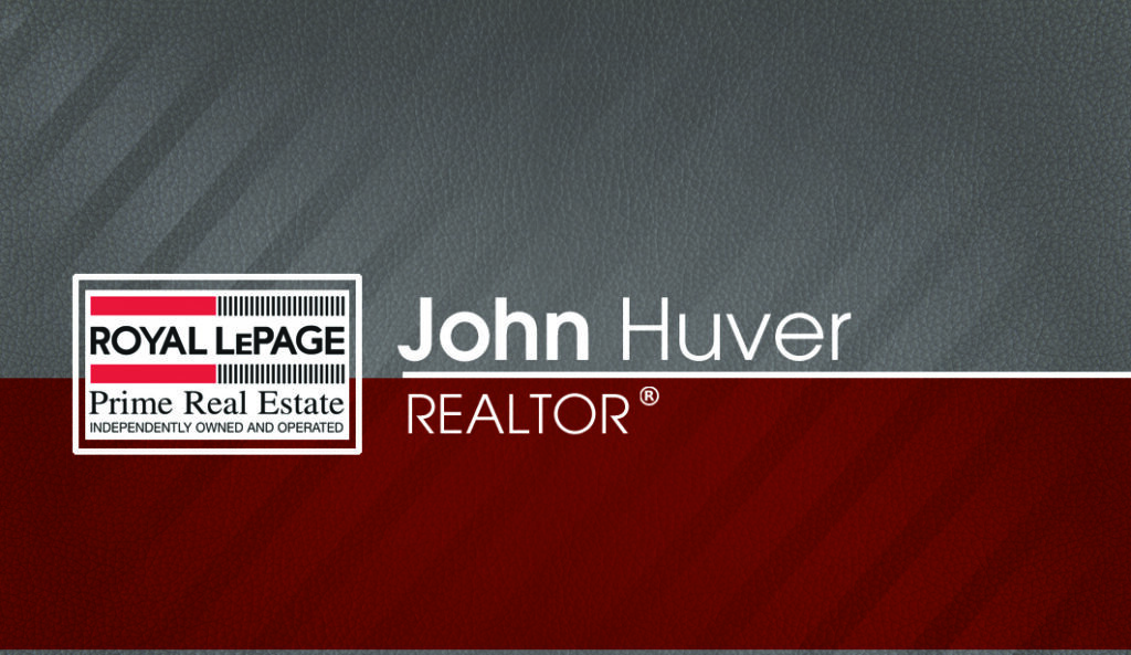
Front Design
The front of the business card displays a clean and elegant layout. John Huver’s name is prominently positioned alongside the title ‘REALTOR®’, ensuring immediate recognition. The Royal LePage logo is strategically placed to leverage brand authority, while the red color block adds a dynamic contrast.
Back Design
The back side of the business card includes John’s personal slogan, “I WORK HARD,” which reinforces his dedication. Contact information is neatly organized for easy readability, and a QR code offers a quick digital gateway to John’s listings, driving potential customers to his online presence.

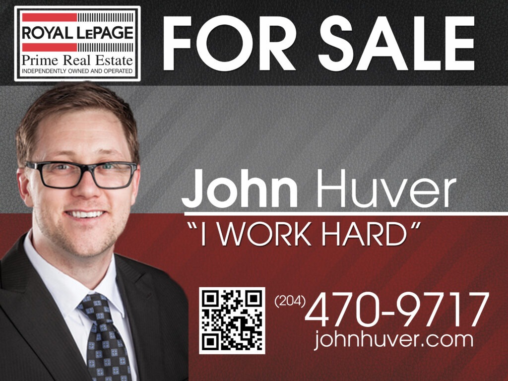
For Sale Sign Design
The ‘For Sale’ sign is a vital point of contact with potential buyers. It features the same color palette and typography as the business cards for brand consistency. The sign is designed to be eye-catching and readable from a distance, with John’s contact number in bold, making it easy for passersby to take note.
Typography and Color Palette
The chosen typeface, a sans-serif font, reflects modernity and approachability. The color palette was selected not only to align with Royal LePage’s brand but also to evoke a sense of energy and passion for the real estate profession.
Imagery and Brand Consistency
Photographs of John Huver present a friendly and approachable image, crucial in building trust with clients. These images are consistent across all materials, further establishing brand recognition.
Functionality and User Experience
Practicality was at the forefront of the design, particularly for the ‘For Sale’ sign, which included a large, scannable QR code. The business cards are designed to be pocket-friendly while providing all necessary contact information at a glance.
Design Process
The design process began with an in-depth analysis of the real estate market and John’s personal brand values. Sketches and digital mockups led to a series of iterations, refining the designs to their final form. Collaboration with a professional printer ensured high-quality physical copies.
Client Feedback and Iterations
Client involvement was critical throughout the design process. John’s feedback was incorporated into each iteration, resulting in a brand identity that truly represents his approach to real estate.
Outcome and Success Measures
The branding has been well-received, with John reporting an increase in client engagement. The QR code, in particular, has seen substantial use, indicating successful integration of the digital and physical aspects of the branding.